Why "Pareto" Should be Part of Your Lexicon
According to the Wikipedia, “A Pareto chart, named after Vilfredo Pareto, is a type of chart that contains both bars and a line graph, where individual values are represented in descending order by bars, and the cumulative total is represented by the line.” A related Wikipedia article on the 80/20 Rule states that “It is a common rule of thumb in business; e.g., "80% of your sales come from 20% of your clients."
AJC maintains that “Pareto” should be part of your lexicon. And, despite that dictionary.com only has “Pareto” in as a noun or modifier, I often use the word “pareto” as a verb, as in “pareto that out”- meaning chart the data by category and plot it in order. It is a terrific way to see where the “biggest fish” in your business are, as in what are the greatest few items to prioritize.
This way of considering items is helpful in so many ways as it can be used to indicate the greatest profit drivers, greatest volume of sales with which subset of SKUs, greatest defects, greatest WIP in a process, etc.
To illustrate, consider the following examples:
This company wanted to start an online distribution channel, but was unsure which of their 655 SKUs to put on it to start.

Turns out only 12% of their 655 SKUs (about 80 products) were making up 80% of their sales volume. Below the chart is blown up to show just the top 80% of SKUs: 80 of the 655 SKUs.
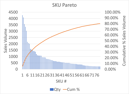
Recommendation: Put those 80 products online first!
In the chart below, this company wanted to know in which category to focus their initial sales efforts when expanding to a new geography.
Looking at their historical sales, it appears that only 2 of their 6 categories drives 80% of their volume.

Recommendation: Start with those two categories in the new geography!
A final example is from a company who had Work-In-Progress (WIP) waiting at various points in a multi-step process. The company needed to know where WIP was building up in order to assign more resources to the steps most in need. Although the 80/20 rule is not perfectly followed here, it is obvious that about 4 of the fifteen steps in the process have the majority of the volume of WIP.

Recommendation: Start the improvement efforts in the four steps where most of the WIP is building up!
As can be seen, once data is “pareto-ed out,” it becomes visually obvious where the greatest opportunities lie. It is a great idea to make Pareto part of your company’s every day lexicon, and get to charting!
This article was originally published February 27, 2017 on LinkedIn.